There are so many ways to look at data. One could potentially create charts all day long!
Without going overboard, I do desire to give you useful information in a way that’s easy to understand. Putting this data into chart form is a natural choice and paints a clear picture of what our Louisville housing market looks like.
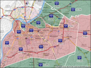
National organizations treat the housing market as a whole and that’s not good enough. For it to be relevant, the home sales data needs to be focused on where you are! That’s why we create the Louisville Housing Report charts for (8) specific areas each month and another (7) each quarter.
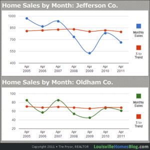
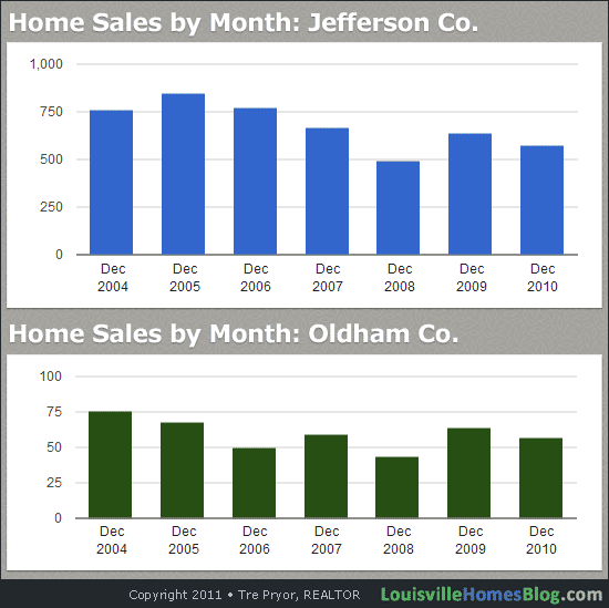
With the addition of this new monthly feature, we’ll be giving you a more historical view of how Louisville home sales have performed in a given month.
As always, we’d love for you to share your thoughts or questions.