Very cool stuff from the NYT putting numbers into picture form for Kentucky migration patterns.
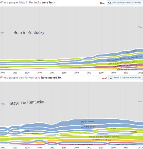
The outside state bringing the most people to Kentucky is Ohio, and Tennessee is second-most. Not too surprising.
Also of interest: Since 1990 more people have been staying in Kentucky than moving out. The time when the largest number of Kentuckians were leaving was in 1990 when only 63% stayed.
I wish they had this data for the city of Louisville.
For the interactive charts for our state and the rest, visit Where We Came From and Where We Went, State by State on the NYT site.